 Daniel Berio
Semi-asemic glyphs
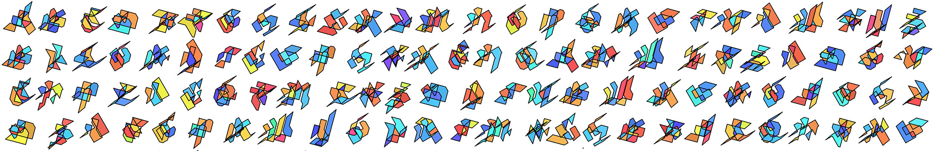
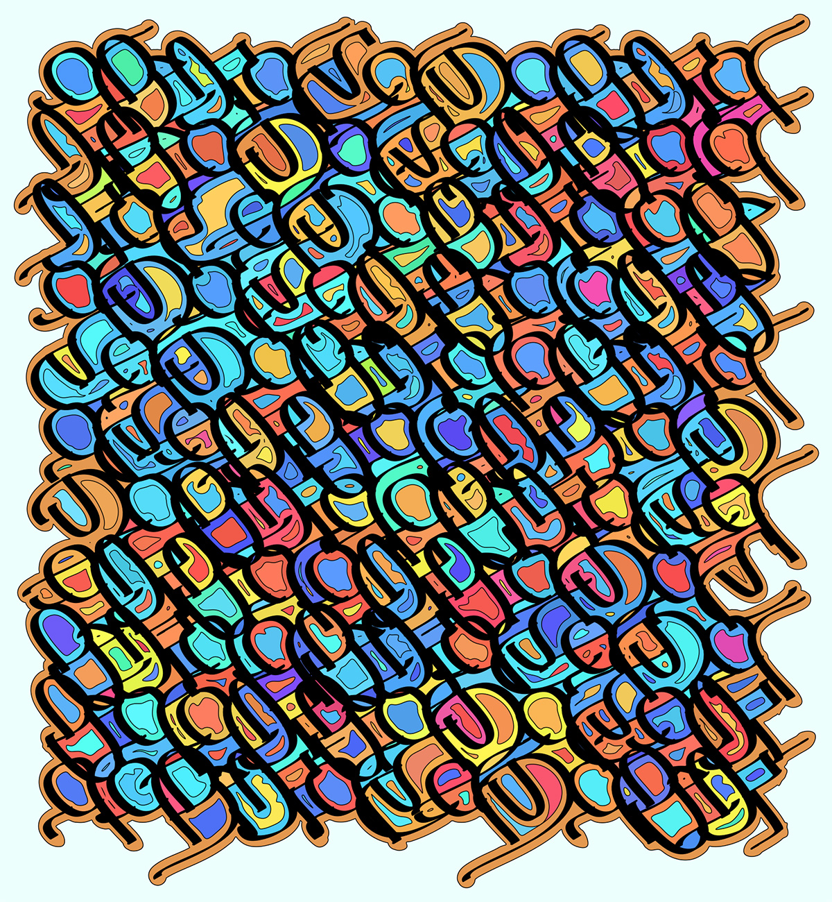
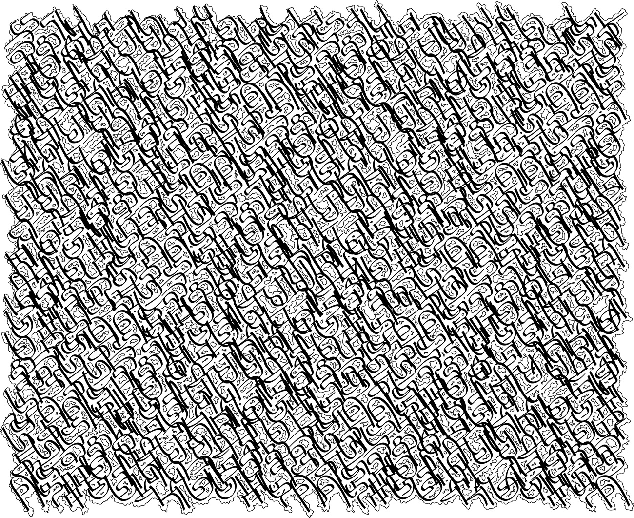
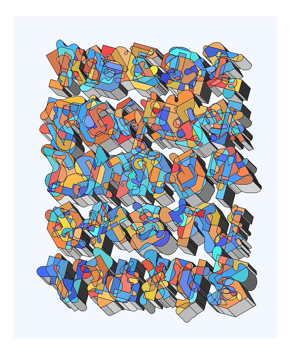
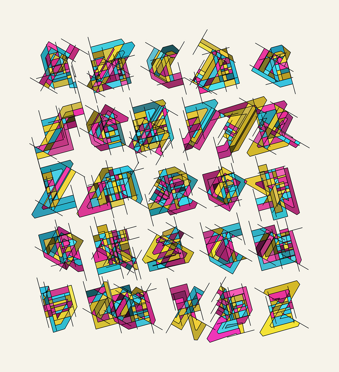
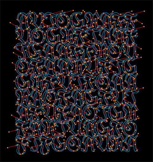
In this line of work I am using a system I developed during my PhD studies to segment font outlines into a skeleton of "strokes", that describe the structure underlying the glyph outlines of a font. The idea behind this is that existing fonts provide a huge variety of letter structures, which can be used as a guide for glyph stylization, abstraction and generation purposes. For example, this is a pattern showing abstracted strokes on a latin square for the word "AUTOGRAFF":
The technical aspects of the stroke segmentation and stylization methods are described in this paper:
Berio, Leymarie & Asente et al. (2022) StrokeStyles: Stroke-based Segmentation and Stylization of Fonts, ACM Transactions on Graphics [link]
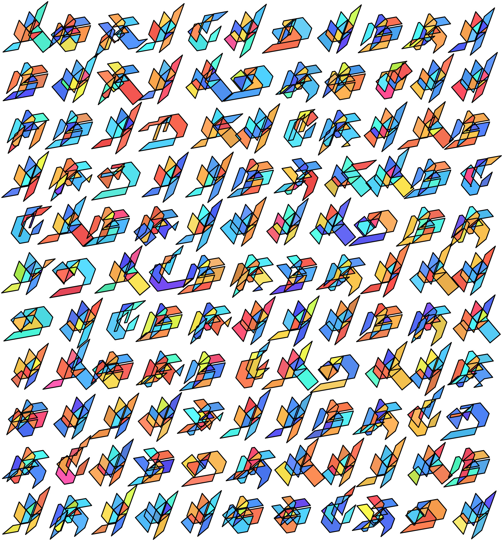
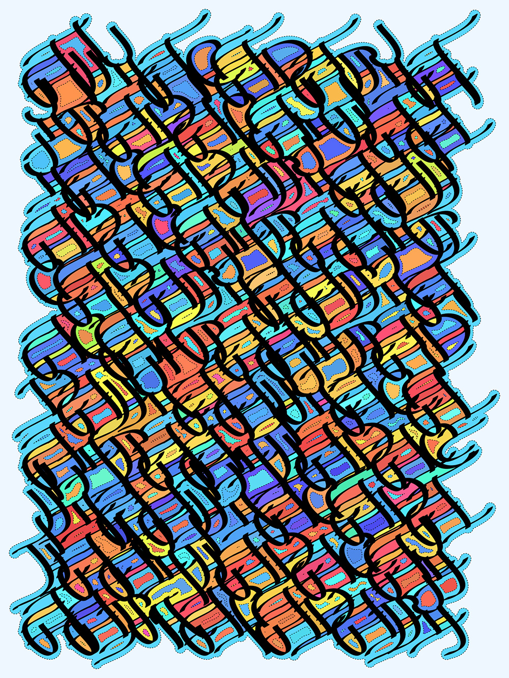
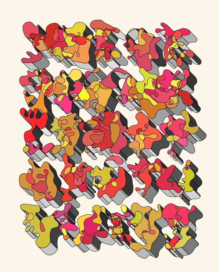
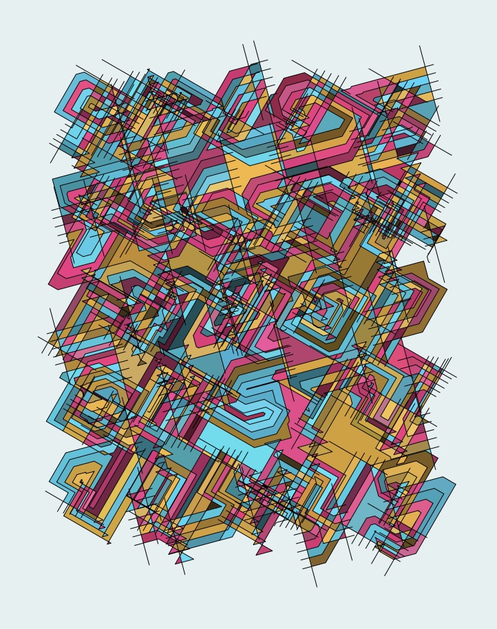
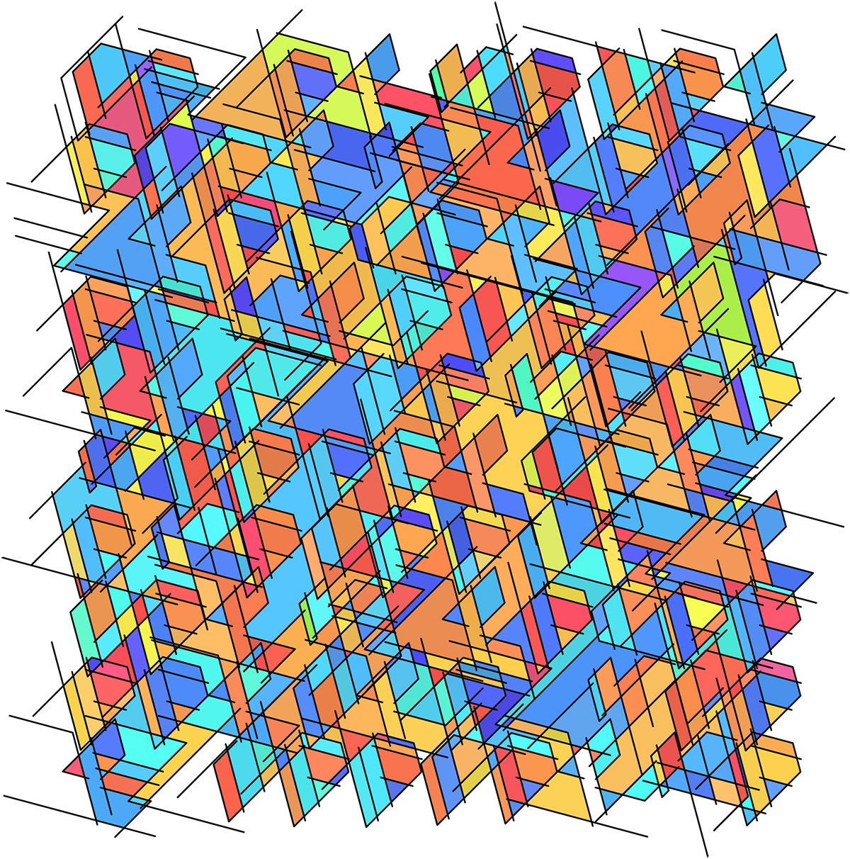
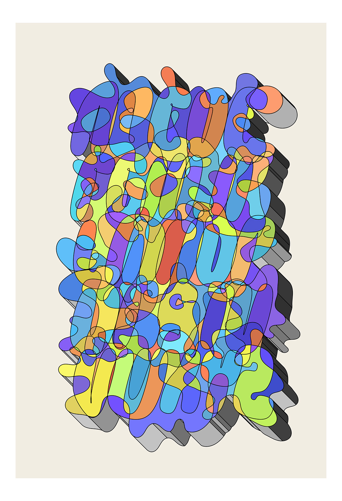
In the following examples I take the stylization to the "extreme" resulting in patterns that become almost (semi) unreadable (asemic)